
For every change there is an angry Linux user. Even when it is easily disabled and never a problem again.
On the flip side - how often do you install new programs so this becomes an annoyance in the first place?
I install something new maybe once a month or less for desktop use. I have not even noticed this blip.
Somewhat more often in and for terminal use.
I was very annoyed when I got this, but remembered that it’s KDE, and turning it off is 4 clicks. Proprietary software often doesn’t allow you to turn this off (easily). Windows has this “feature”, where is the setting?
I don’t think it’s a productive “feature”, but considering it can be turned off so easily I don’t consider it a complete showstopper.
I find KDE’s settings app isn’t always easy to find settings in, especially when you have no idea what to call a feature.
This! KDE’s settings are a mess to navigate. I completely understand why that person didn’t know there even was a configuration for this.
It sounds like the author of the article is more concerned with the incentive it creates for developers to push useless or sloppy updates (“impact driven development”) than the UX.
How does this give incentive for that?
My understanding is that this only happens in newly installed apps, not recently updates ones. They are only highlighted because the user installed them, not because the developer did anything.
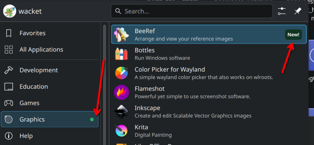
It’s a screenshot of the application launcher, the menu to launch apps already installed, not the software store.
My mistake is that’s the case.
Windows has this “feature”, where is the setting?
I assume youre talking about W11?
Because the “Show recently added apps” setting is third option in the start menu settings on W10.
The main issue is UX imo. On Windows 11, it’s “5 clicks”, but you have to open the settings app and find the setting two submenus deep. On KDE, it’s right click > configure application launcher > toggle setting > apply.
This kind of bullshit shouldn’t ever be on by default. KDawful reminds me again why I ditched it for XFCE.
I think it’s still an interesting question whether this feature should be enabled by default (and most people seem to agree it should be).
If it wasn’t on by default, the kind of person who would benefit from it wouldn’t discover it.
The kind if person who would benefit from that shouldn’t be using a computer. But then again, most smartphone users shouldn’t be using a phone. How about choosing different default settings in an installation based on a central “expert” vs “newbie” setting?
What qualifies as “expert” setting can be very divisive… for me, it would be removing this menu entirely. Or even switching from KDE to sway or similar ^^U
But if I was the kind of people that do use this kind of menus I would probably find that kind of indication useful. It helps finding the category the app you just installed belongs to. If you install an educational app/game that teaches programming by giving instructions to a turtle in order to draw a graphic/picture (I think I have seen something like that before): which category should it be at? games? education? development? graphics?
I recently installer something, and KDE showed me where it ended up in the launcher, which I appreciated, and now I’m not supposed to use a computer. Really? Thanks.
At least me wife will be happy, but I’ll need to find new work.
People who find computers useful should be using computers.
This weird idea from some linux users that only people who see their computer as a hobby and have mastery over them should be allowed to use them, and that computers should be designed exclusively around the needs of computer-as-hobby users, is absolutely nuts.
Its a tool. It should be designed to be useful as possible to anyone who needs such a tool.
Sincerely,
Another linux user who cares about UI/UX and is tired of this kind of junk. It’s a dumb argument, let’s all stop making it please. Linux supports all your “technical user” wildest dreams, let the average people have their features and design considerations too.Oh. You’re one of them. I can safely ignore you.
I think it’s a great feature. I can now quickly find the thing I just installed in my menu.
Yeah. Plus they immediately got a reply from someone showing where you can turn it off in settings.
I’m glad there’s a toggle, it seems like it would actually be useful here but I’d probably turn it off.
With that said, there’s a special place in hell for the multitudes of apps that have red notification dots all over the UI with no clear indicator as to what they’re about or how to clear them :D
Yeah, I hate those little dots and I inevitably jump through the hoops until I’ve clicked enough things to make them go away.
Lol does that mean he should donate the second 100€
He said “I’ll donate 100 EUR if you remove”, so I think he may be obligated to donate every single time this option is disabled.
Funny little read there.
There is a setting, but I was equally annoyed that it is on by default.
Even more surprising - when I launched the new app miltiple times, it was still marked as new.
It’s probably time based.
And this kind of thing isn’t for the type of people who mess with settings. If this defaulted to off, then it would actually be useless.
If this defaulted to off, then it would actually be useless.
Would just be the other way around with what posts you see online. Instead of OP you’d see “how can I find my newly installed apps” and the same “ahem” screenshot reply.
Hahaha, what a great way to start tuesday morning.
deleted by creator
It’s more about which category a particular specific software belongs. If a kid installs an educational app/game that teaches programming by giving instructions to a turtle in order to draw a graphic/picture (I think I have seen something like that before). Which category should it be? games? education? development? graphics?
I personally don’t use this kind of menus with categories, I prefer dmenu style launchers where you type to search what you need. But if I was the kind of people that do use this kind of menus I would probably find that kind of indication useful.
You are right, the marker at the category level definitely makes sense to find the application initially.
Some apps have weird names and I forget what they’re called. Showing a “new” badge, even if it’s just for the first few times I open the app, makes it more likely that I’ll remember the app’s name.
deleted by creator
I dunno man.
It’s not like linux applications ever have different app-names in the menu, when compared to the package name you just saw when installing it.
That has never tripped me up. No. Never.
/S
deleted by creator
You can set most KDE menus to show the “Comment” key of the .desktop files instead of the “Name” key. So “KDE Advanced Text Editor” instead of “Kate”.
Packages can come with several “programs” that aren’t necessarily named the same as the package. Example: Calibre installs menu items for “Calibre”, “EBookViewer” and “EBookEditor” on my distro.
It’s not about forgetting…it’ about helping to quickly find what you just installed and what is all included.
OP specifically said “forget”, that’s what I was referring to.
Sound like a really nice person /s


