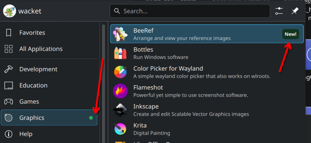
I cannot explain how much I do not want to see this green dot and “New!” text in my application launcher. Rather than be a passionate contributor like you, I have regrettably become a slave to the Big Tech industry - But one thing I can provide is insight into why operating systems like iOS and Windows have this noise: Impact driven development People need to justify their work on a continuous basis, with the upside of promotions and downside of layoffs. They add the most useless feature...

I’m glad there’s a toggle, it seems like it would actually be useful here but I’d probably turn it off.
With that said, there’s a special place in hell for the multitudes of apps that have red notification dots all over the UI with no clear indicator as to what they’re about or how to clear them :D
Yeah, I hate those little dots and I inevitably jump through the hoops until I’ve clicked enough things to make them go away.