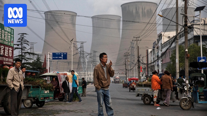
Man, they’re twisting the data hard to try to make China look good here. They’re falling back on per capita, and cumulative to try to hide that they’re the largest emitter of carbon by far, much of it is from burning coal, which they are still doing much more than any other country.
Per capita emissions favour densly packed high population countries.
I dont think countries thay have 5m people should be held to the same number as ones that have 1billion. For nz the best way for us to reduce our per capita emissions is to add another 50m people but that would be counter productive since we want to reduce overall pollution.
Do you have actual data for that? Here are some comparisons of population density and emissions per capita:
The first chart is every country and territory that wikipedia had numbers for on both population density and emissions per capita.
The second has outliers with the highest densities and emissions per capita removed in order to make the rest visible (removed entries are Bahrain, Bangladesh, Barbados, Bermuda, Brunei, Gibraltar, Hong Kong, Kuwait, Macau, Maldives, Moldova, New Caledonia, Palau, Qatar, and Singapore. I hope you agree that these are not particularly comparable to the US or China for a variety of reasons and are okay to exclude).
The third cuts it down to only countries that have a “very high” rating (at least 0.8) on the Human Development Index, as a proxy for advanced economies. As you can see, there is not a strong correlation between high densities and low emissions. Chile, Sweden, Argentina, and Norway all actually have both significantly lower densities than the US and significantly lower emissions (and there are more, I’m just counting some with populations of at least ten million). Same goes for NZ, there are several countries with comparable or lower densities and also lower emissions. The densest countries are not particularly low emitters, and the sparsest cover the full range.
I can think of a few potential factors explaining it. Yes, high density makes transport easier, but it also means less access to land for clean energy (which is generally much less compact than fossil fuels). Additionally, even in very sparsely-populated countries, most of the population actually tends to be fairly concentrated around a few cities anyway. Consider Australia; it’s not like Australians are evenly distributed across the continent, so the very low population density isn’t particularly representative of the infrastructure challenges for most people there
Maybe… but… remember ten years ago when there were all those articles about how “China is building train stations to no-where!” and today those same train stations are now in the center of new bustling cities? Isn’t this what we’d expect to see, right at the start of a pivot to green energy?
If you observe snapshots in time you’d understand what the facts are at that point in time. If you observe the trends at a point in time, you’d understand what things are likely to look at a future point in time. To me the interesting and informative bit is the trend and its short and long term projections. E.g. that it points to peak oil consumption within a couple of years and that it points to reduction of the leverage of OPEC and the US over China along any downstream effects.


Man, they’re twisting the data hard to try to make China look good here. They’re falling back on per capita, and cumulative to try to hide that they’re the largest emitter of carbon by far, much of it is from burning coal, which they are still doing much more than any other country.
This is greenwashing, nothing more.
National emissions should be approached per capita. It’d be silly to expect that Luxembourg and France should have the same total emissions
Per capita emissions favour densly packed high population countries.
I dont think countries thay have 5m people should be held to the same number as ones that have 1billion. For nz the best way for us to reduce our per capita emissions is to add another 50m people but that would be counter productive since we want to reduce overall pollution.
Do you have actual data for that? Here are some comparisons of population density and emissions per capita:
The first chart is every country and territory that wikipedia had numbers for on both population density and emissions per capita.
The second has outliers with the highest densities and emissions per capita removed in order to make the rest visible (removed entries are Bahrain, Bangladesh, Barbados, Bermuda, Brunei, Gibraltar, Hong Kong, Kuwait, Macau, Maldives, Moldova, New Caledonia, Palau, Qatar, and Singapore. I hope you agree that these are not particularly comparable to the US or China for a variety of reasons and are okay to exclude).
The third cuts it down to only countries that have a “very high” rating (at least 0.8) on the Human Development Index, as a proxy for advanced economies. As you can see, there is not a strong correlation between high densities and low emissions. Chile, Sweden, Argentina, and Norway all actually have both significantly lower densities than the US and significantly lower emissions (and there are more, I’m just counting some with populations of at least ten million). Same goes for NZ, there are several countries with comparable or lower densities and also lower emissions. The densest countries are not particularly low emitters, and the sparsest cover the full range.
I can think of a few potential factors explaining it. Yes, high density makes transport easier, but it also means less access to land for clean energy (which is generally much less compact than fossil fuels). Additionally, even in very sparsely-populated countries, most of the population actually tends to be fairly concentrated around a few cities anyway. Consider Australia; it’s not like Australians are evenly distributed across the continent, so the very low population density isn’t particularly representative of the infrastructure challenges for most people there
Maybe… but… remember ten years ago when there were all those articles about how “China is building train stations to no-where!” and today those same train stations are now in the center of new bustling cities? Isn’t this what we’d expect to see, right at the start of a pivot to green energy?
bustling…cities?
not what I’ve seen. I’ve seen entire 30 floor buildings empty.
just because there is a “city” doesn’t mean it’s populated.
If you observe snapshots in time you’d understand what the facts are at that point in time. If you observe the trends at a point in time, you’d understand what things are likely to look at a future point in time. To me the interesting and informative bit is the trend and its short and long term projections. E.g. that it points to peak oil consumption within a couple of years and that it points to reduction of the leverage of OPEC and the US over China along any downstream effects.