

4·
1 year agobangs are invaluable, and the main reason i stick with ddg. having !w and !pcgw just instantly take me to the right page is great
fortune favours the bold, but i favour the italic


bangs are invaluable, and the main reason i stick with ddg. having !w and !pcgw just instantly take me to the right page is great

yeah, that’s basically when i play most aaa games - when the mood takes me, but mostly ~10 years old. i’ve just recently finally played wofenstein new order, followed by the tomb raider legend trilogy (they’re really short), and i’ve now started on the tomb raider survivor trilogy
indie games i tend to play a bit sooner; partly because they’re cheaper and partly because i feel they’re more likely to use (and need) the money to make more games. although the last indie game i played was fez, and the dev of that has quit completely…
manyatruenerd is pretty much the only gaming youtuber I follow anymore. he’s just so positive and always finds some good in a game (apart from redfall)

meh, i’d say they’re obviously buttons from context (why would a calculator app just have a bunch of random unclickable symbols?). but assuming they don’t immediately read to you as buttons; md3 calc app only has 8 buttons: AC, (), , ÷, ×, -, +, & =. the rest is just exactly the same mess of text randomly laid out edit 2023-08-03: i have now looked at this image on a better calibrated monitor. the numbers actually do have background circles (why did no-one pick me up on this). however, this does prove my point about the complete lack of any contrast on anything
having areas is good as it allows the eye to do a sort of binary search: if i want a scientific function i’ll look in the white on blue, operators in blue on white, numbers in black on white; then search for the exact button i want. without that, everything’s an unorganised mess (for instance why are brackets in the same section as operators?), with some functions hidden in the v button at the top right
also i’ve just noticed - how do the brackets work in md3? do you have to tap the button once to bring up a menu and then tap the bracket you want? or does it automatically insert one based on whether you’re inside a set? if it’s the latter, how does one do nested brackets?
tinfoil hat time, but i’m pretty sure that’s why they were trying to introduce web bundles a few years ago. thankfully they seem to have flopped, but if they hadn’t and chromium introduced a closed source interpreter i think that would have been the end of anything non-chromium
i wouldn’t even mind the colours if they didn’t tint the background. tinting solely the main text colour and the main buttons might look quite nice. to be honest though, i just loathe pastel colours in general, so it’s possible that’s influencing my opinion
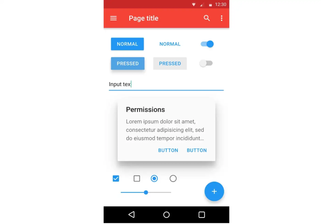
personal opinion, i think padding is worse for delineating objects than a bit of colour; or just, like, a line. look at this example - there are four distinct segments on the left, whereas on the right they all merge into one and a half
padding is really useful, yes, but if you put padding on everything then what’s there to be separated?
yeah, i hated material ew as soon as it was announced. so much padding everywhere, and so little contrast - to paraphrase the incredibles: if everything’s orange[1], nothing is. your eyes will adjust to it. i want actionable items to stand out, not be a slightly lighter shade of the same colour. it also looks rather like a fischer-price my first phone interface
i must say, if an app (for example, jerboa) uses material 3, i usually try to look for an alternative
[1] other colours are available, i just like orange
edit: some examples:
with material design, it’s clear what’s a header, what’s a footer,[2] and what each button’s state is.
with all the padding, there’s also less space; leading to less functionality
with material ew, it’s much harder to tell at a glance what each app is, one has to scrutinise the icon rather than just tell at a glance by colour
i also really dislike monet; the way it pulls this horrible washed out sickly pastel colour from a wallpaper and washes it over the entire app. if i just pulled one accent colour, and applied that to, say, the header and main action button, i’d like it a lot more
[2] look at the lack of contrast on that “new post” button
i like it. i’m glad to see a bit of depth and personality coming back into the design à la mode
it’s an official http response code
oh nice, thank you. i could have sworn i checked reddact, shreddit and pds, but i guess not
i think i’ll be doing this tonight
i don’t suppose you’d send it to me when you’re done?
i’ve been looking for a script that adds to comments rather than overwriting them, so i can put “this user has moved to lemmy” without losing any information
because fdroid build all of their apps themselves, so every app on the fdroid repo uses the fdroid signing key

instances aren’t like subreddits in this example though. if i don’t care about drama, i can subscribe to both r/tumblr and r/curatedtumblr and have them both appear in my feed. i can’t do that with instances without creating two accounts, and browsing both separately
i’ll be honest, i’m not sure what that’s for? is it moving to another account if you want to change your home instance? if so, that’s a good idea, i could add it to the post if you want in case this comment gets buried
although i’m not entirely certain using https://github.com/Rob--W/cors-anywhere/issues/301 is a great idea…
i hate it… : (
the old one looked really good; it had character and skeuomorphism and stood out in the instance list
the new one looks… fine, i guess. it’s there. i can’t really say anything about it, apart from it’s a bit dark and too busy, but it has nothing going for it
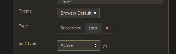
have you tried changing the “type” option in lemmy.world/settings/ (or [yourinstance]/settings)?
idea: let each instance have a prepopulated blocklist
let the admins of each instance have a list of blocked users that gets inherited to members of that instance, but let users remove from that list as well as add to avoid abuse. and don’t hide the comments from these users, just collapse them to let people know a comment has been hidden in case of mistakes
(possibly even allow regex to avoid RandomWord1234, which was common on reddit)
this is a rather extreme tactic though, only for if spam becomes overwhelming
nooo, the icon was one of the things that drew me to .world
i don’t know whether it’s original or taken from somewhere, but it’s so glossy and nice
flat design has always been boring, but it’s starting to become unfashionable as well


the “risk” of false positives comes down to the consequence. if the consequence is being stuck in the slammer, don’t use ai. if the consequence is you can’t upload the image unless you manually appeal, or even maybe have to use an external image host; i think ai is fine
edit: ah bugger, wrong acct. ah well
(please tag @[email protected] if you want me to see your response)