Sorry for a probably stupid question but can’t you get something with a dedicated GPU for the same price? The CPU will be worse but the machine will be more balanced for all kinds of tasks. Not for programming though.
After the last experience, very proudly homophobic.
- 17 Posts
- 973 Comments
Just continue using Signal. Why change it to something else and worse?

 1·4 hours ago
Mister/miss, LLMs that can run locally are fine. It’s the infrastructure and the large scale of commercial cloud LLMs that create some issues. You have to read some researches on this topic.

 1·5 hours ago
This. But 99% of the internet will hate your project for absolutely anything they don’t like in it and it will kill the project because distros won’t want to use it.

 1·5 hours ago
Too much of an environmental impact for the usefulness imo.

 1·5 hours ago
Afaik you are wrong. Idk about Invidious but Piped proxies all traffic through the server so it’s almost like a regular proxy that people used before VPN was a thing. It stores user data if you sign up but it is not necessary and if you don’t do it, the data will be stored locally with an ability to make a JSON backup of it.
Welcome to modern Linux where almost everything works, mister/miss
What I meant by a “middleground” is that GOS has gapps, even though they are sandboxed. There is no way it can be more degoogled than LOS or any other fully vanilla ROM that’s actually degoogled.

 1·5 hours ago
Do you mean that any copying is bad or any copying is ok as long as it helps achieve the goals?

 1·5 hours ago
Yea I thought about that too. But apparently some people find “AI” useful.

 1·17 hours ago
GNOME Software but it only has Flatpaks which my machine can’t quite run smoothly. It’s weird that I use the GNOME ecosystem without Flatpaks though. Anyways I just use the AUR on my system that’s based on Arch btw.
Say that to capitalists.

 5·20 hours ago
May be but some of this user’s post history is a bit questionable.

 5·20 hours ago
Judging from your post and replies, you look very aggressive, rude and demanding so no wonder the devs deleted your comments.

 4·20 hours ago
This is turning into a meaningless argument now. I don’t want to continue.

 5·21 hours ago
Citation very much needed
Ubuntu, RHEL and Fedora use it as the default and they are very big distros. Idk if it’s enough but that’s what I know.
Hardly, but I’m guessing you’re thinking of reliability instead.
Idk. KDE was unstable for me and it always has bugs after major releases. They should test things better.
Not really surprising when it’s so stripped down that vanilla GNOME is pretty much unusable.
Personal opinion.
That fact makes it especially funny that vanilla GNOME is by far the fattest DE around.
Deepin.
How it manages to use up more resources than KDE is beyond me.
You have a point here. Qt is better in terms of efficiency afaik and performance is extremely important for an OS component. But hey at least it’s getting better over time.

 31·21 hours ago
I don’t hate it, it looks better than what was there before, no doubts there, but at the same time they could’ve just made it better.
How? Improving something like this is hard. Do you have any proposals?
All the literature on action buttons with dangerous effects tells you to add margins, accents and shades. Any design undergraduate should be aware of this, however the GNOME team totally missed it.
I’m afraid to tell you that in 2024 nobody cares about that. “Shape following feeling” in MD is the best example I can think of. Now aesthetics is preferred to make people buy (or use for free in this case) the product. People are not tech savvy. They want good looks and GNOME nailed it imo. It’s stunning. They even got me but I do care about aesthetics unfortunately. I’m a spoilt mass consumer. Eject me if you will.
accent color
Accent color taboo. Let’s not talk about accent color.

 2·21 hours ago
Mister/miss, you’re going too far with this advertising imo.

 51·21 hours ago
I get it that you hate this design and its obvious strong inspiration by Apple but accusing GNOME team in being lazy is too much. They created the most popular and one of the most stable DEs on Linux and their own workflow that’s similar to Apple’s but still is unique. Also when I saw that new design, I was amazed. To me it looks really great. It’s going to be a good update with accent color support (I won’t fight about it ok?) for sure. It’s just a matter of preference. Both designs are good enough technically imo.



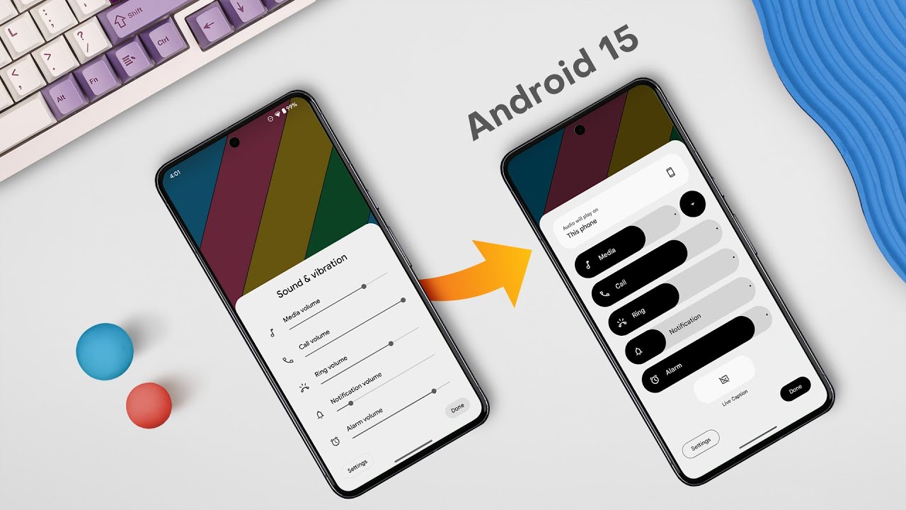





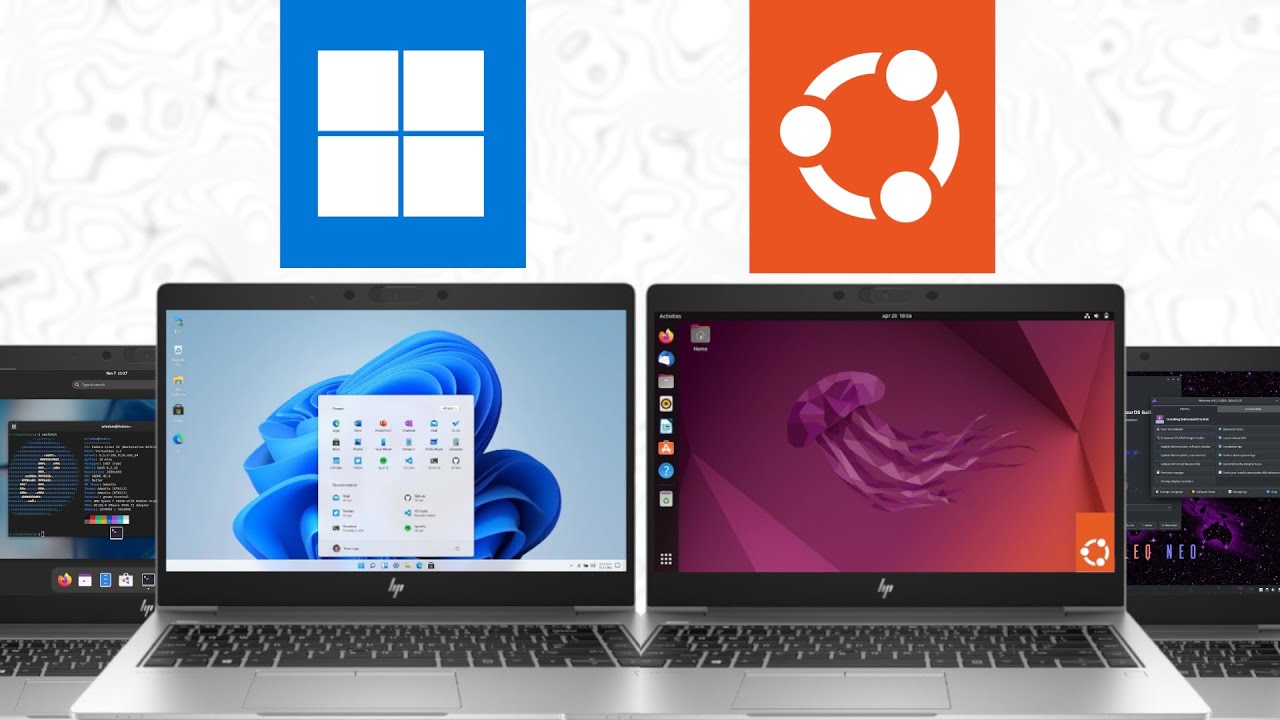
Oh ok then. If it has a vanilla version then it is degoogled and can be more degoogled than LOS. What I meant was if GOS was microg only, it couldn’t be as degoogled as LOS because LOS is vanilla. Still it’s a shame that LOS can’t find a better supporter than Google.