I really don’t like the design of the progress pride flag, and I couldn’t really put my finger on it until I saw this: https://nava.org/good-flag-bad-flag
For reference, here is the flag I’m referencing as “bad flag”:

And here is the original:

So, the original has too many colors, but it’s the colors of the rainbow. In order. It’s recognizable from really far away, and it’s dead simple to draw.
With the Intersex flag, that’s 14 colors. There are three shades of “purple”. The circle won’t be visible from far away. The chevrons are too thin to be very recognizable from far away.
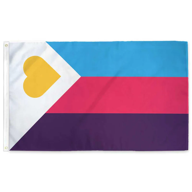
It’s not like there aren’t good pride flags. Like there are AMAZING ones:


Edit:
In case you don’t know what these are: https://flagsforgood.com/collections/pride-flags


Same here, I don’t understand the need to include ethnicity in a gender and sexuality flag. The flag was fine and already represented diversity. The fuck?
Also very america-centric. Different races are oppressed in different places.
Yeah, very America-centric because here in Mexico we’ve been fine with the former flag. We have arguably less of all the USAmerican-everything the flag stands for. 😅