I really don’t like the design of the progress pride flag, and I couldn’t really put my finger on it until I saw this: https://nava.org/good-flag-bad-flag
For reference, here is the flag I’m referencing as “bad flag”:

And here is the original:

So, the original has too many colors, but it’s the colors of the rainbow. In order. It’s recognizable from really far away, and it’s dead simple to draw.
With the Intersex flag, that’s 14 colors. There are three shades of “purple”. The circle won’t be visible from far away. The chevrons are too thin to be very recognizable from far away.
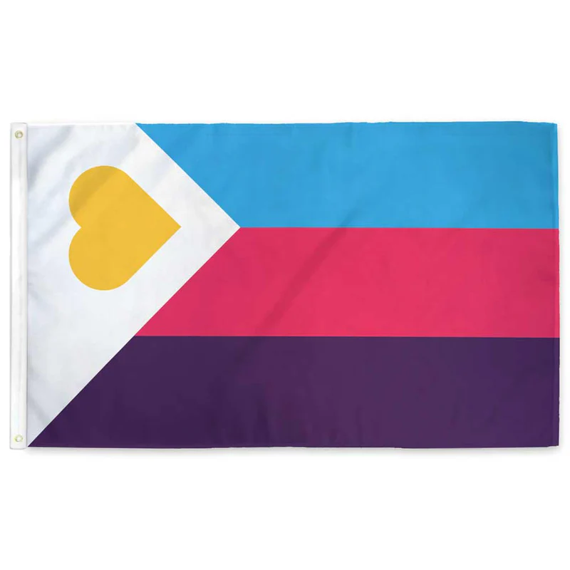
It’s not like there aren’t good pride flags. Like there are AMAZING ones:


Edit:
In case you don’t know what these are: https://flagsforgood.com/collections/pride-flags


I doubt it’ll ever be redesigned.
The reason it’s badly designed as is, is that people wanted specific inclusion into the primary symbol. There’s really no way to change a rainbow; it’s the standard spectrum of visible light being used as a symbol of everyone in their diversity being part of a group.
To be any more inclusive, you have to put things on top of the already inclusive rainbow. A corner piece or an inset is the only way to do that that isn’t horrible looking no matter what it is.
The chevrons from the side are at least visually balanced, though not well chosen colorwise. Then again, the representative colors weren’t chosen with being added to a flag in the first place.
Once you start changing an established symbol rather than just coming up with a new one, design goes out the window. It’s no longer cohesive because it can’t be. It’s like the difference between someone planning a tattoo that covers their arm, and someone getting a few dozen tattoos on their arm. Shoving things together without a plan ahead of time is airways going to be less visually pleasing.
But, visual pleasance isn’t what the flag is for, so maybe it’s more effective than something planned from the beginning. I dunno, but the fact that it isn’t “just” a rainbow does mean you can’t mistake it for someone liking rainbows in general, so that could be a benefit of that change.
I don’t agree that the original rainbow flag has too many colors though. If you don’t have the standard color spectrum there, it isn’t a rainbow to most people’s minds, so it would be worse design. The standard ROYGBV is standard for a pigment rainbow for a good reason.
I’m not advocating for removing the rainbow. You could literally “cut” a big rectangle in the middle and just have a different color background with extra things, paying homage to the original rainbow flag and having center balance. The only good thing I have to say about the chevrons are that it establishes vertical and horizontal orientation.
I’ll have to mull over your statement about being more effective that something planned from the beginning.